How to Practise Shading17 lessons
Shading is what turns a line drawing into something that feels real. These lessons focus on reading light, mapping values, and applying pencil marks that describe volume rather than just darkness.
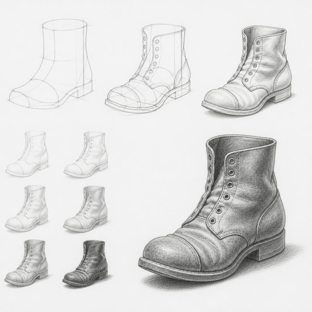
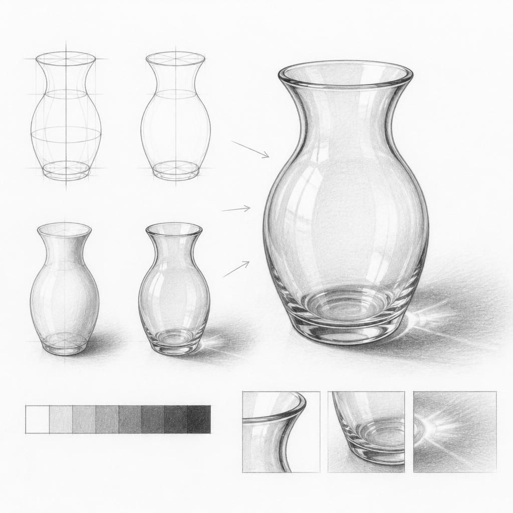
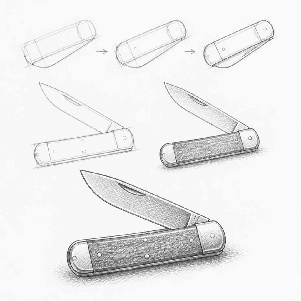
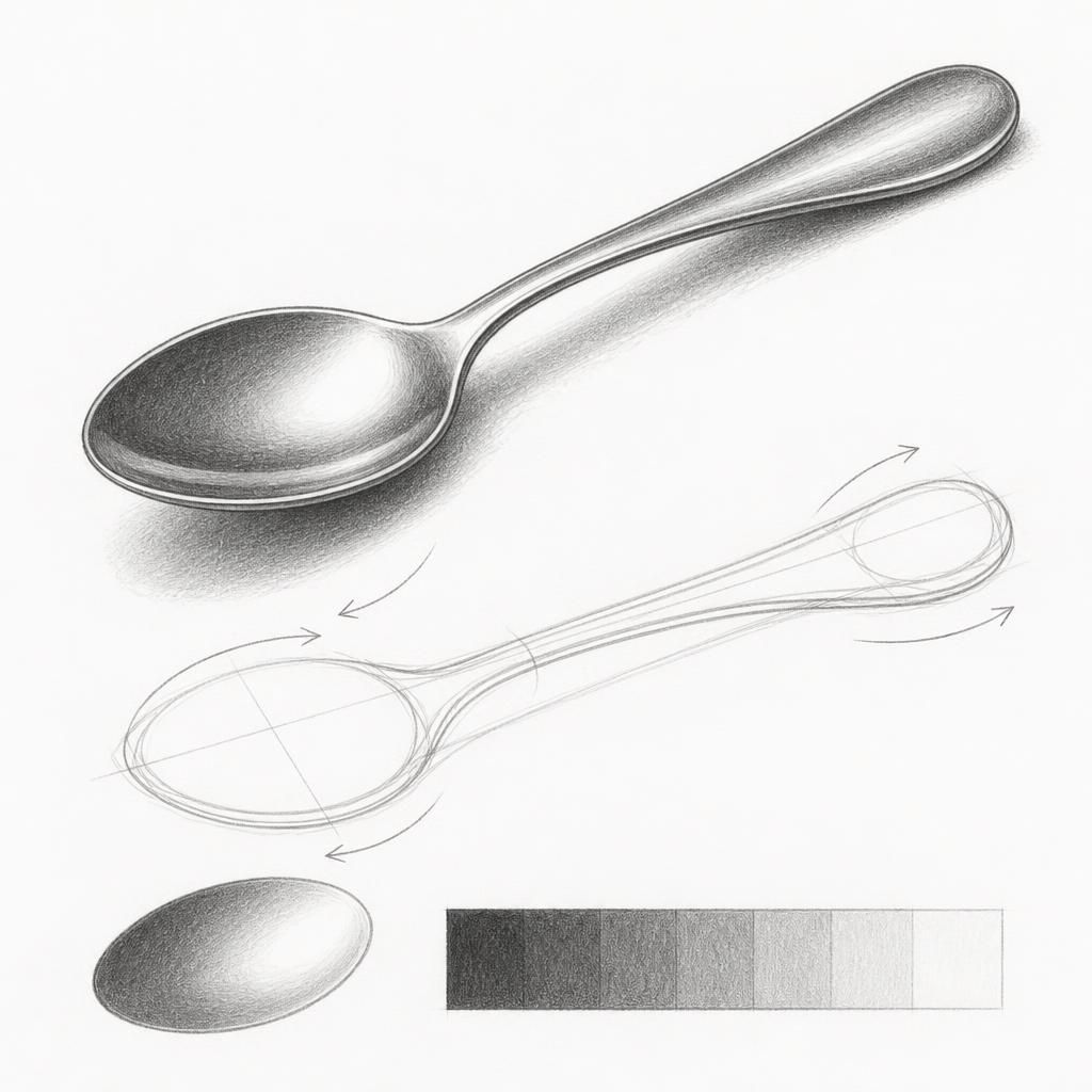
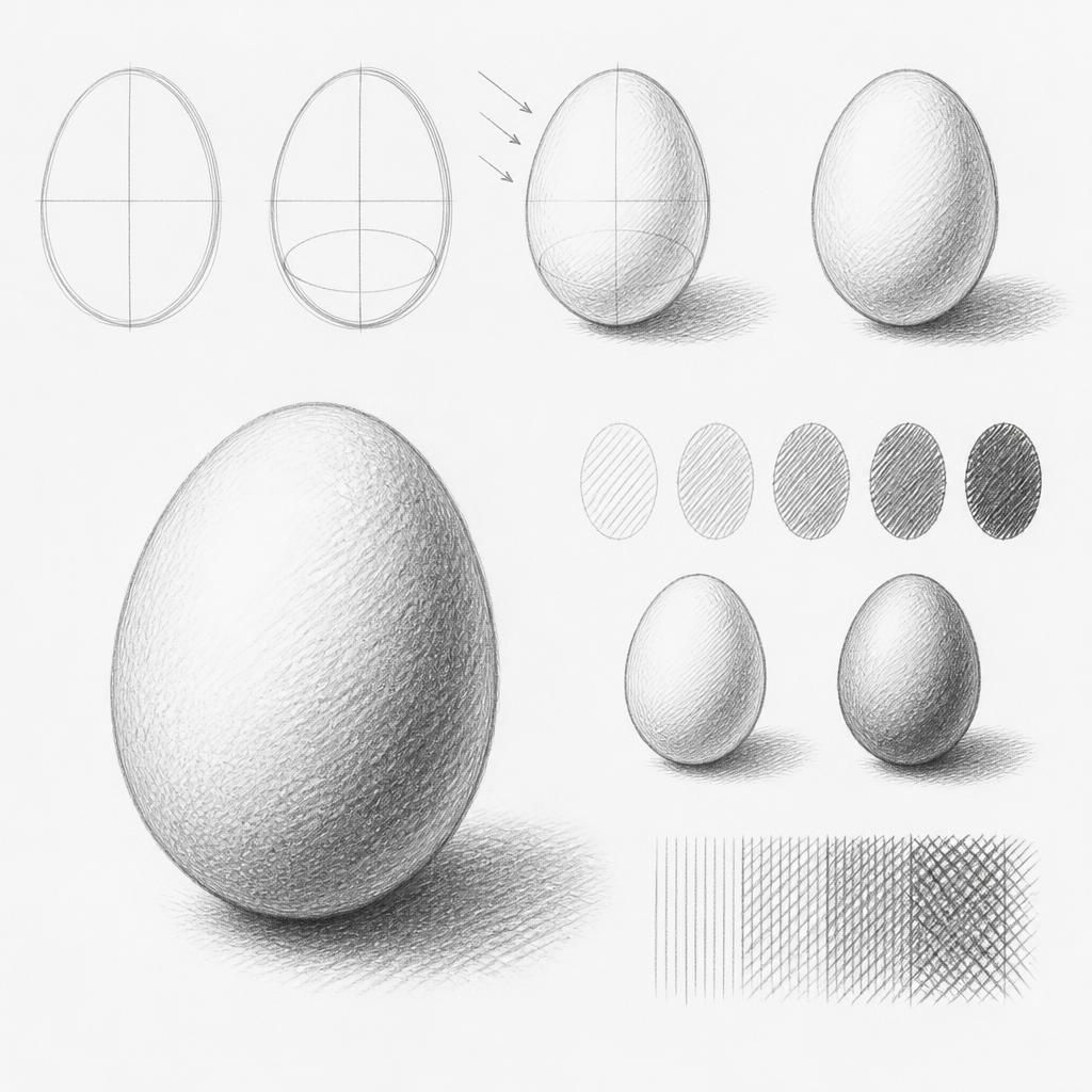
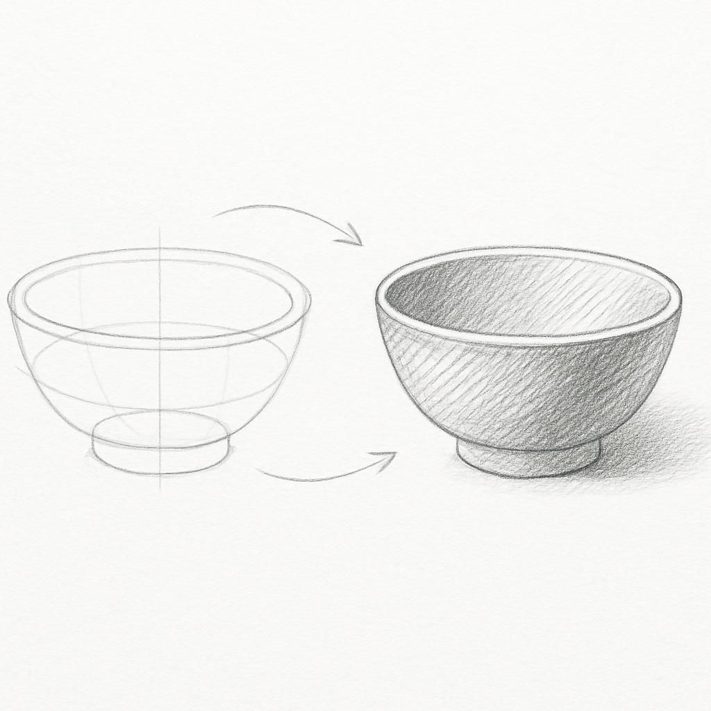

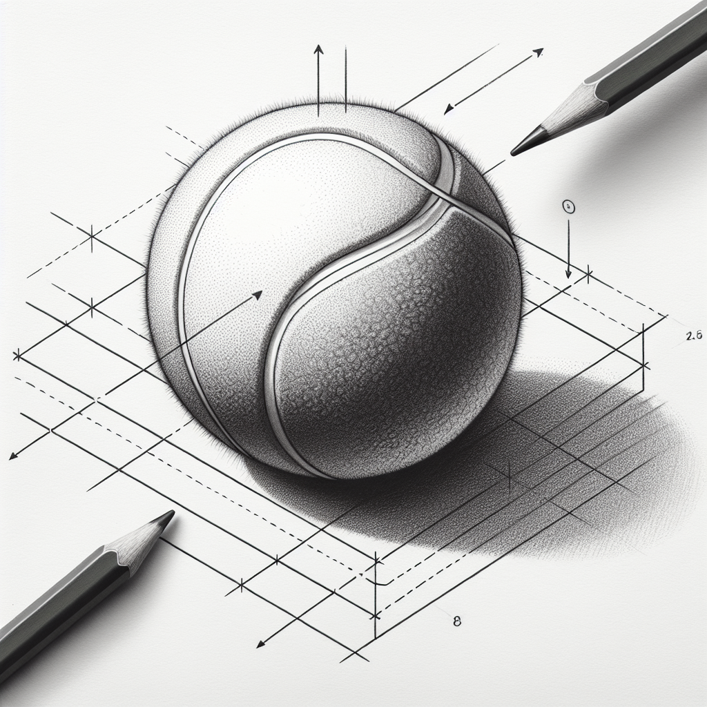
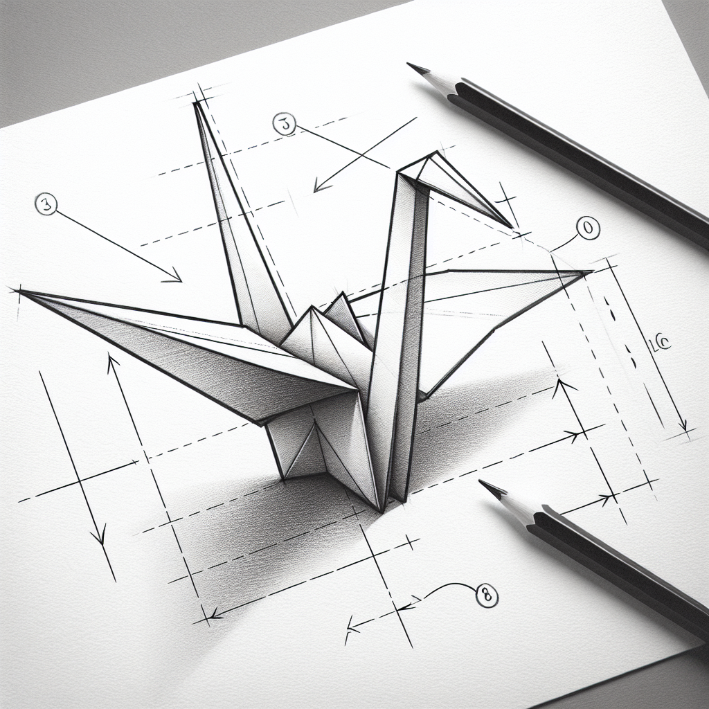
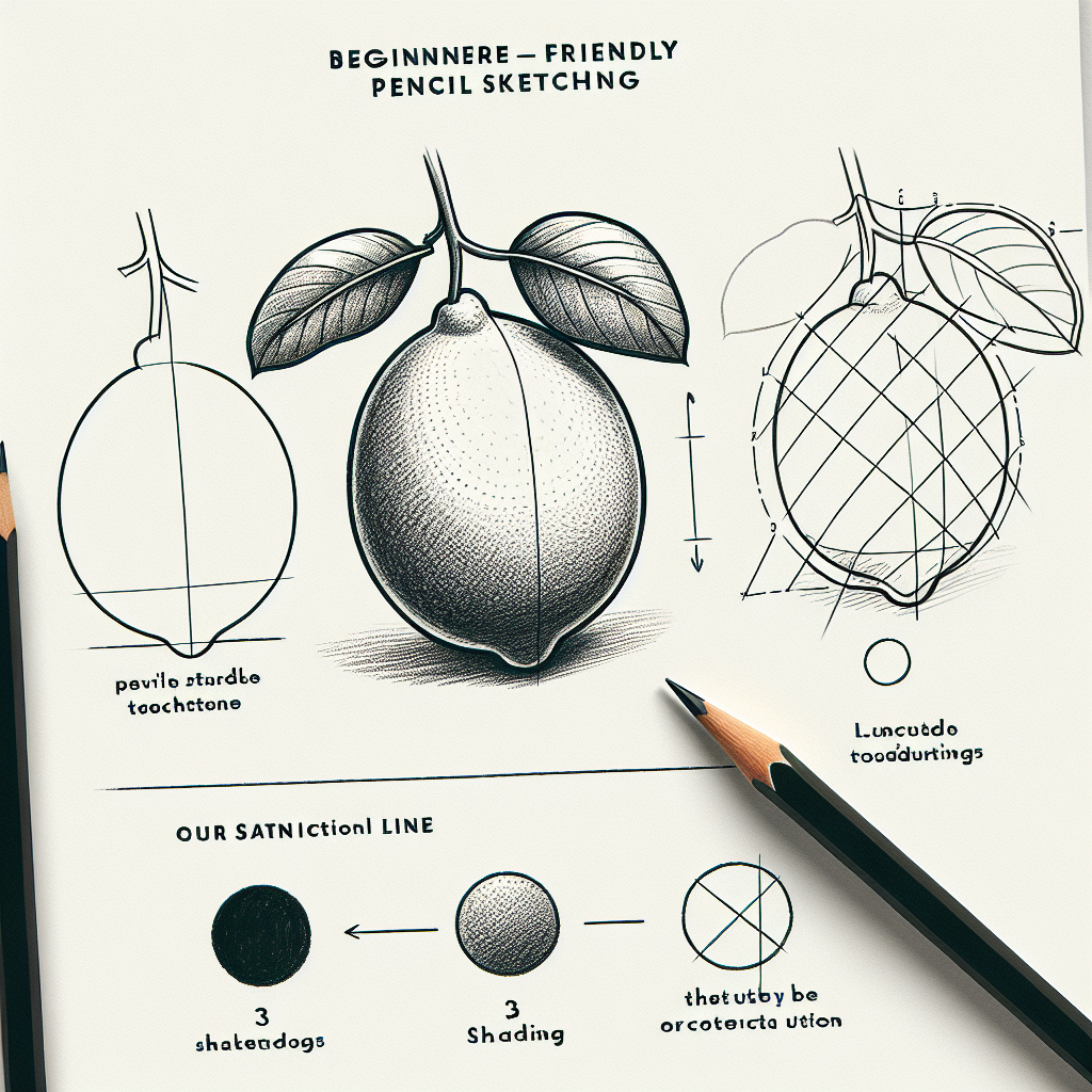


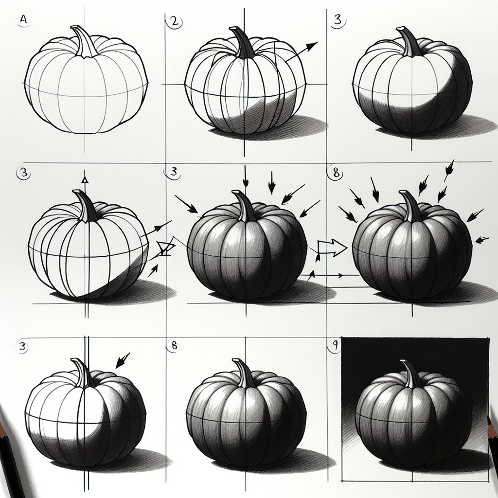


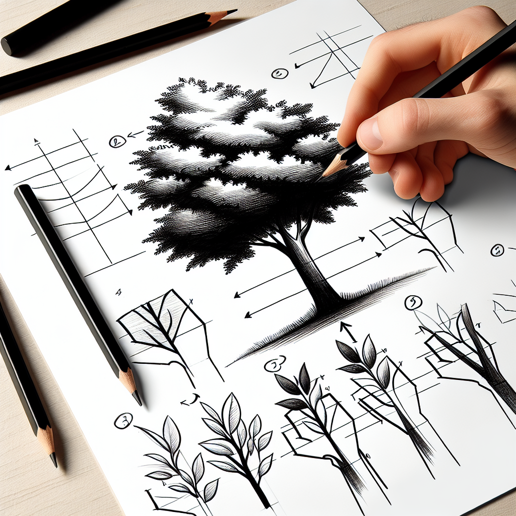

Shading is where a flat outline starts to sit in real light. The trick isn't pressing harder. It's deciding where the light comes from and letting every value follow from that one choice.
Commit to one light source
Before shading anything, pick a single light direction and stick to it. Every plane facing that light stays pale, every plane turning away darkens, and the shadow the object casts falls on the opposite side. Beginners get muddy results because they shade what happens to look dark in patches instead of reasoning it all out from one consistent source.
Map values, don't just darken
Squint at your reference until the detail drops away and you see three or four flat shapes of tone: light, mid, dark, and the accent. Block those in as separate zones before you smooth a single transition. A drawing reads as solid when its values are grouped and clearly separated, not when every square millimetre has its own delicate gradient.
Build tone with directional marks
Instead of scrubbing back and forth, lay parallel strokes that follow the form's surface, curving them around a sphere and keeping them straight across a flat plane. Cross a second layer over the first to deepen the value without crushing the paper. Controlled hatching lets you darken gradually and keeps the sketch feeling like it's made of describable planes rather than smudge.