How to Practise Drawing Textures16 lessons
Texture is how pencil marks start to feel like fur, metal, glass, or fabric. These short exercises use a single object to isolate one surface at a time.
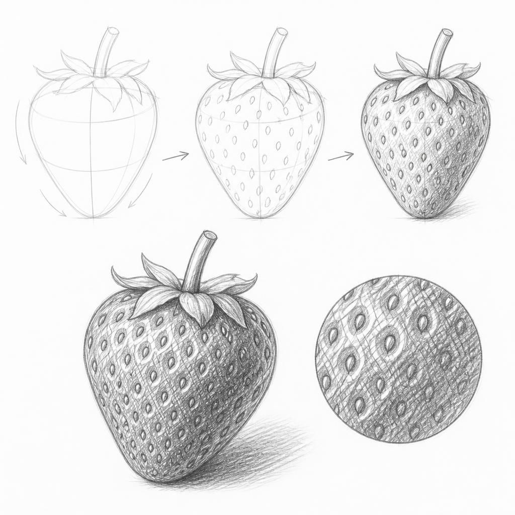
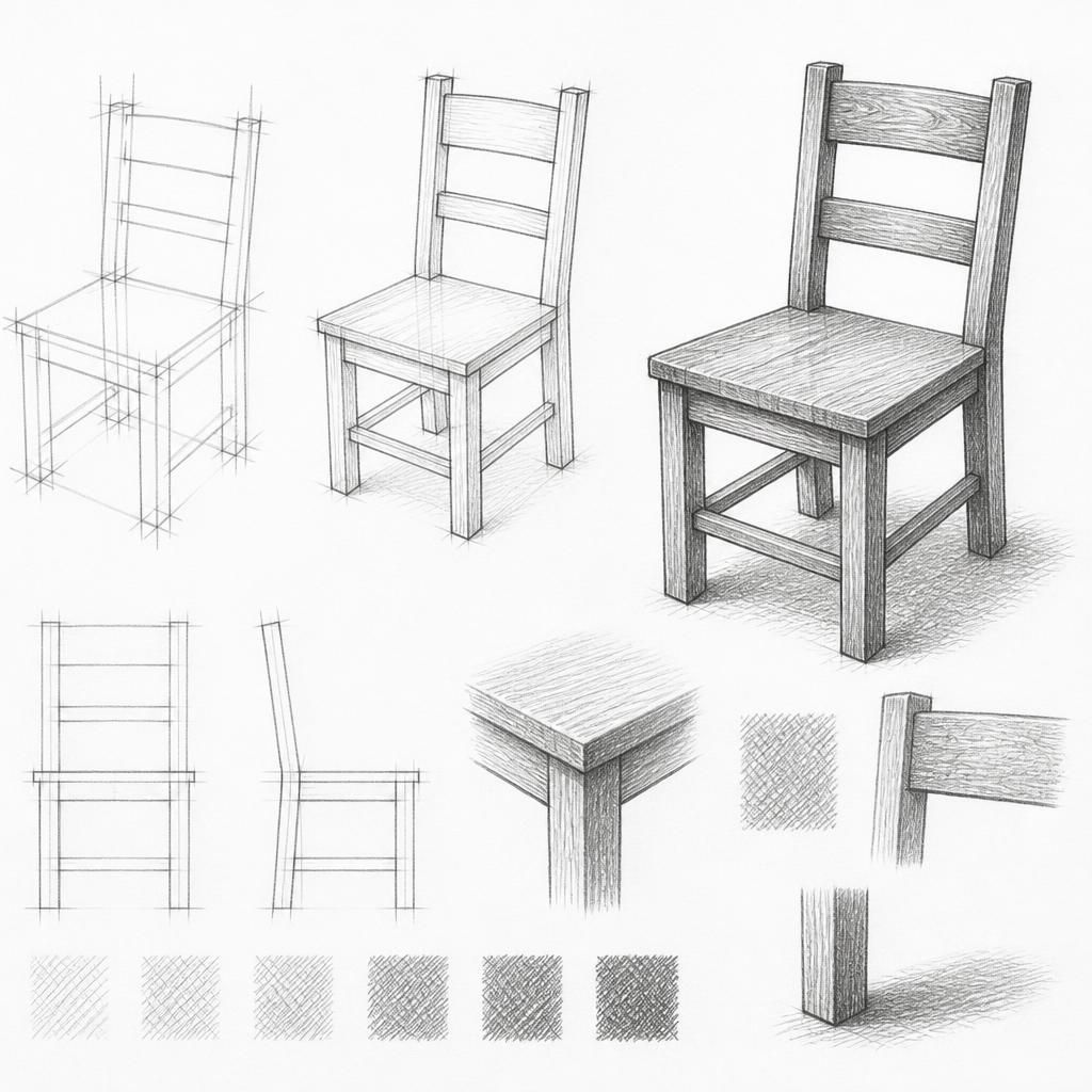
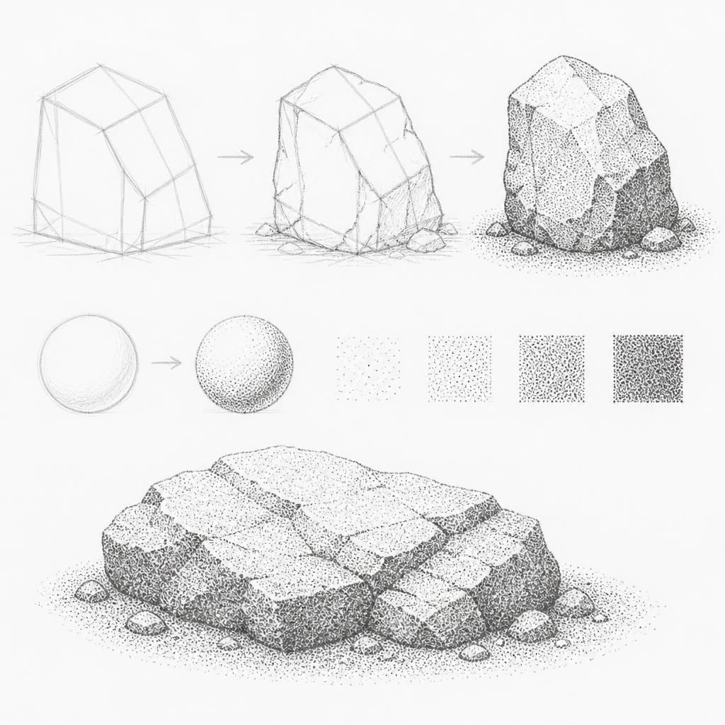
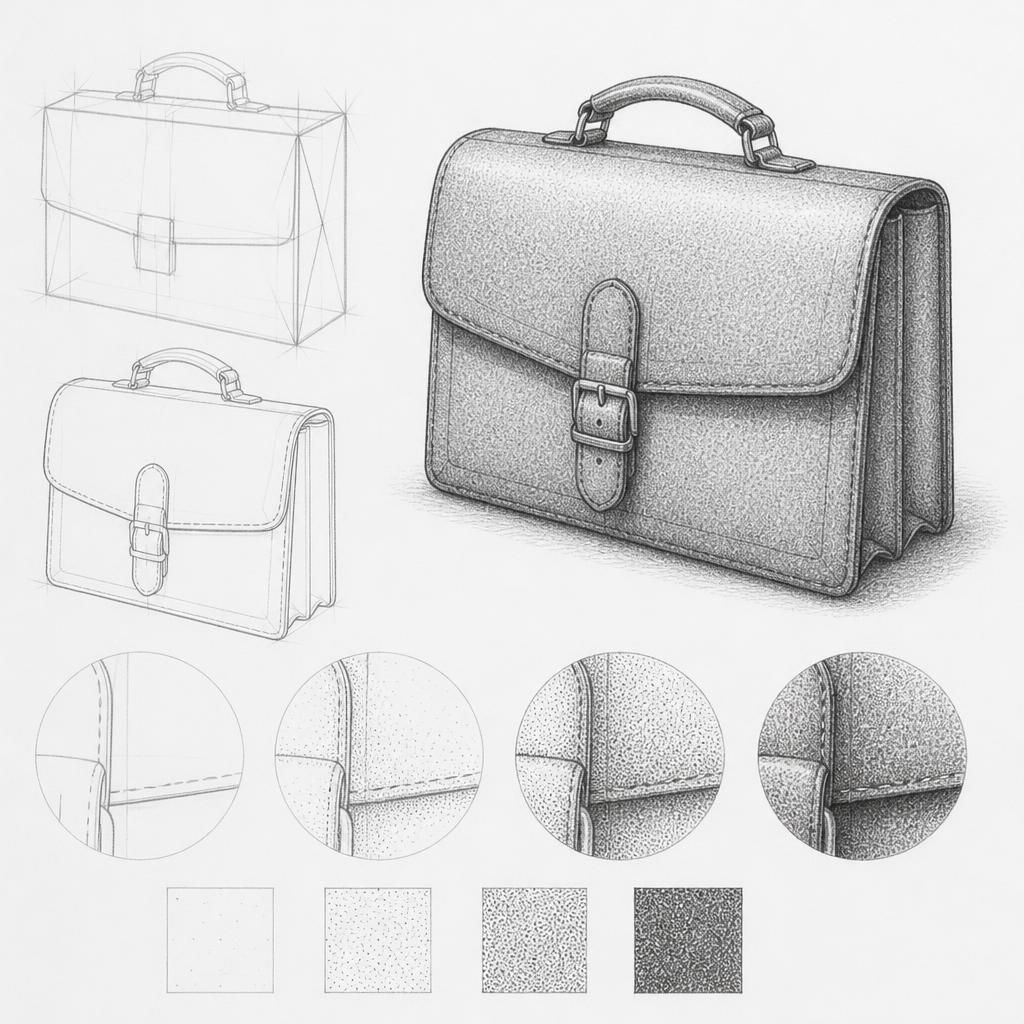
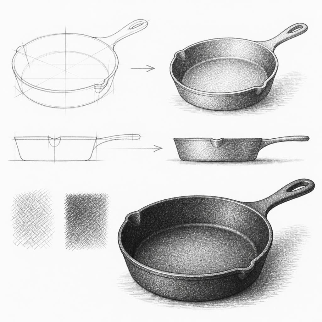
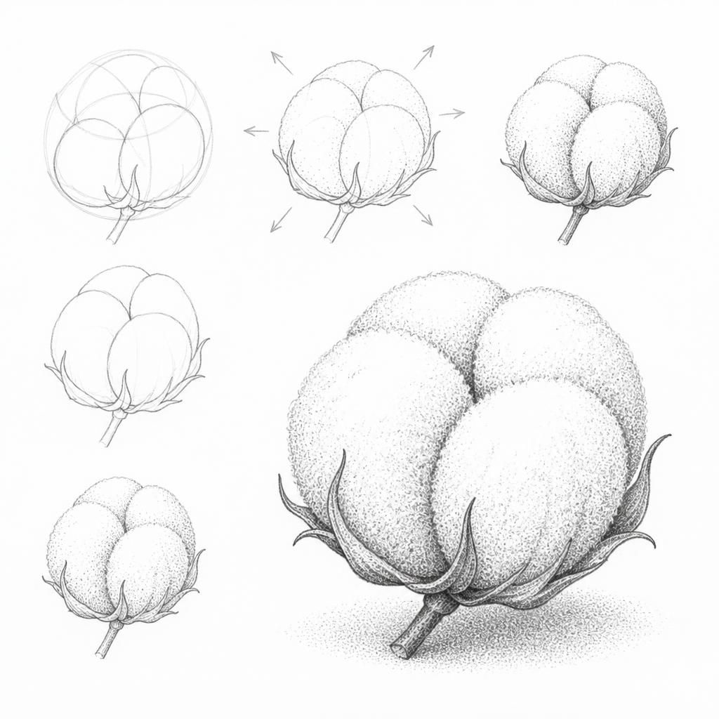
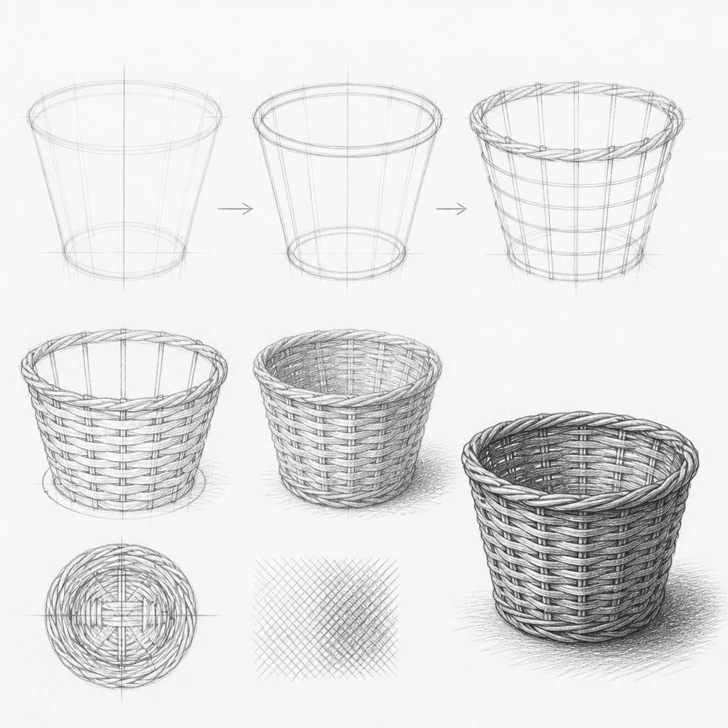
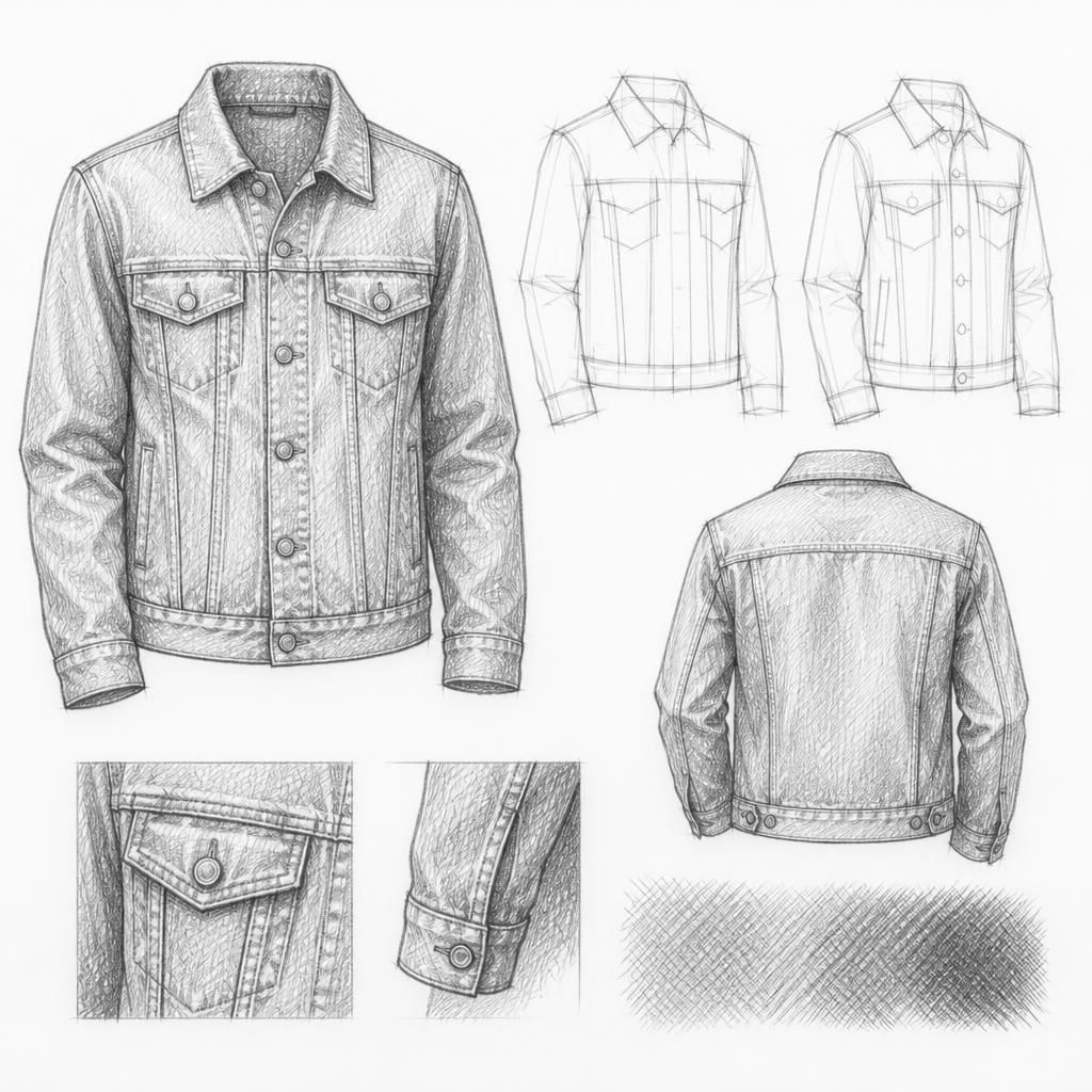
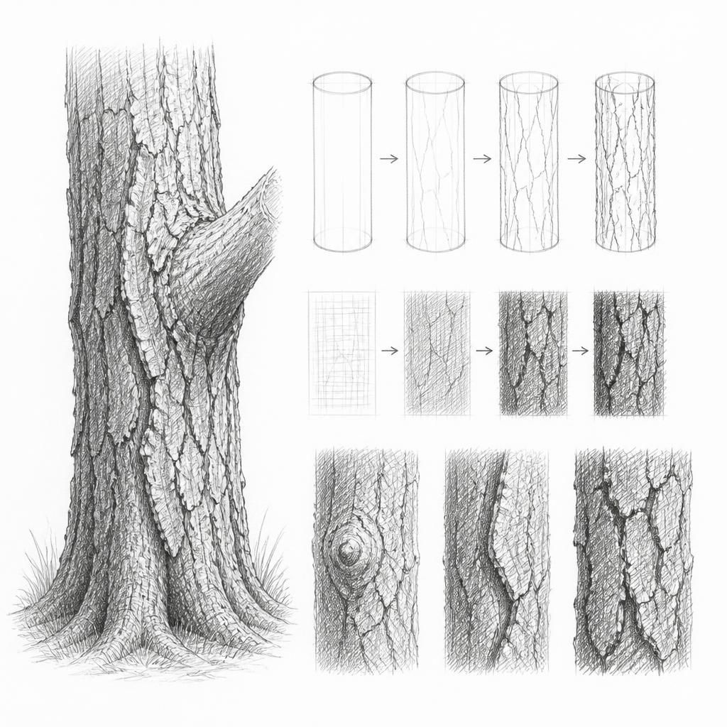
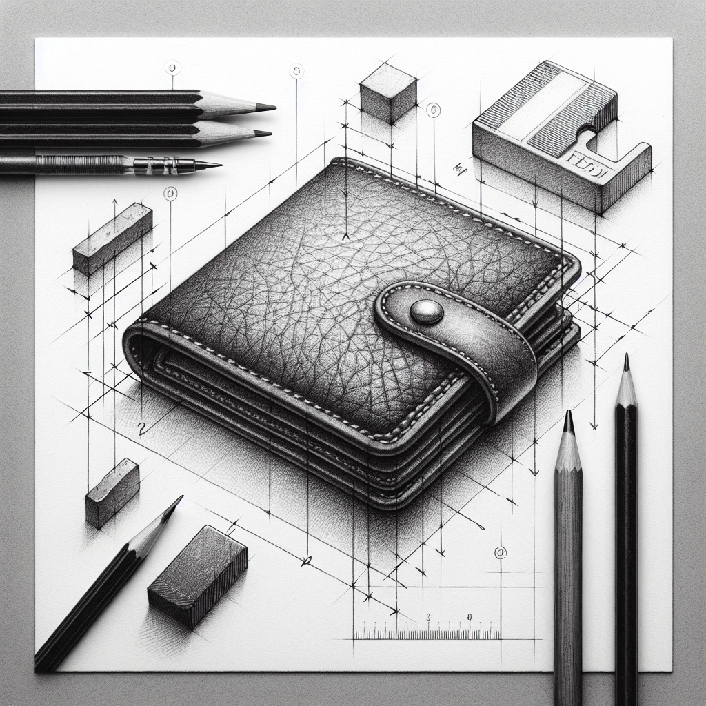
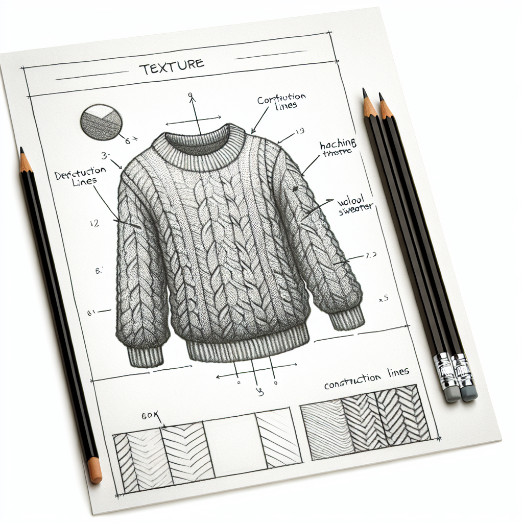
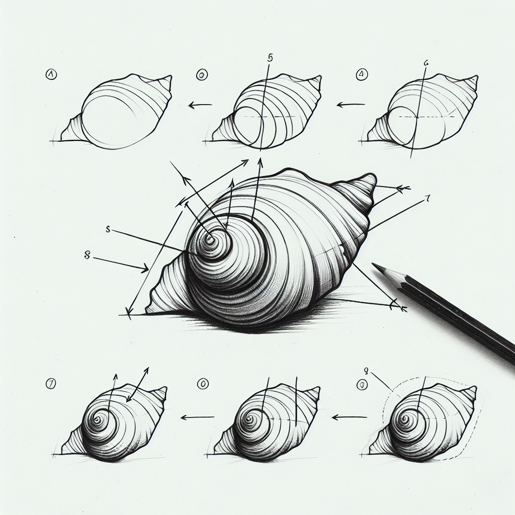
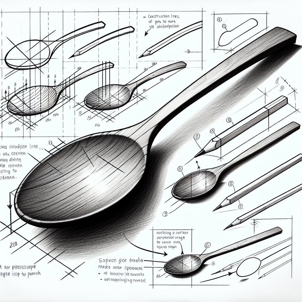
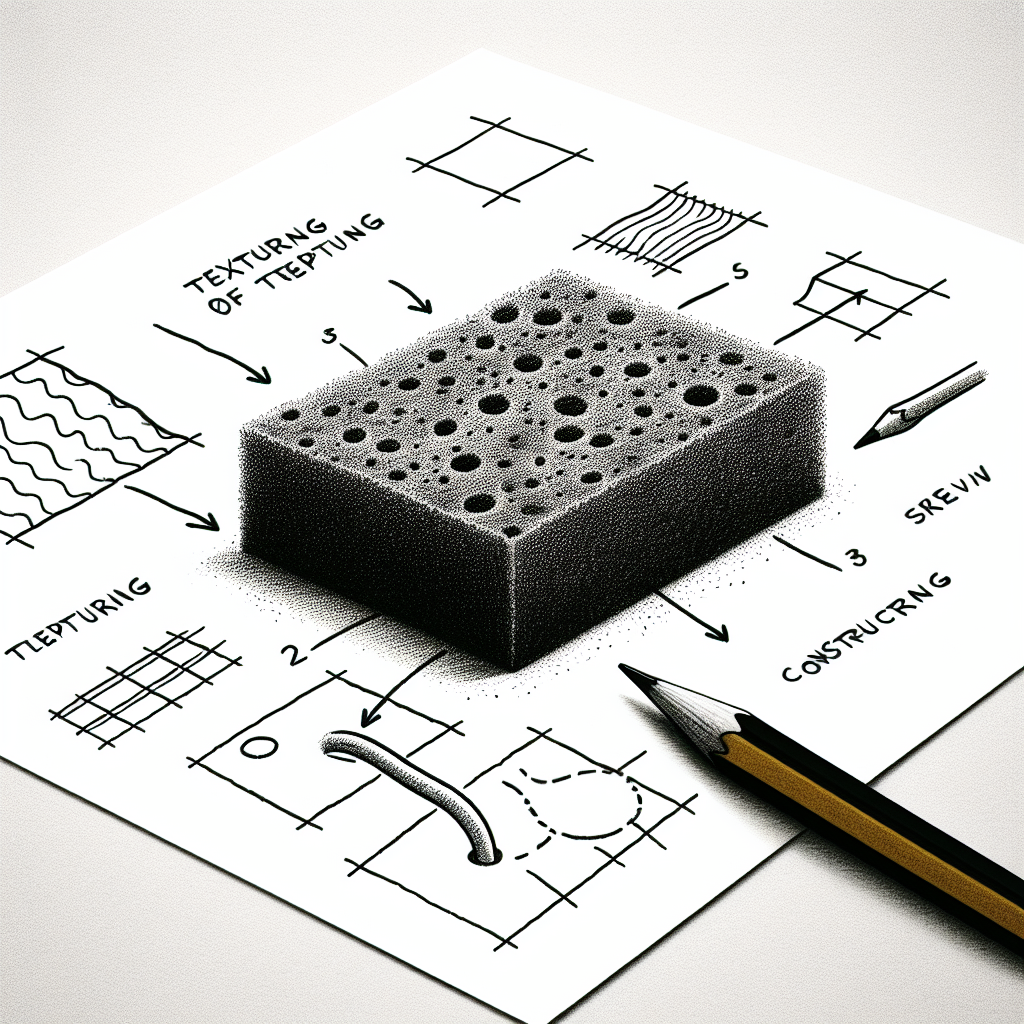
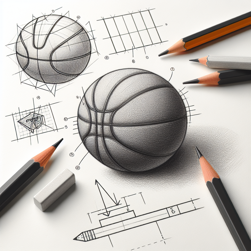
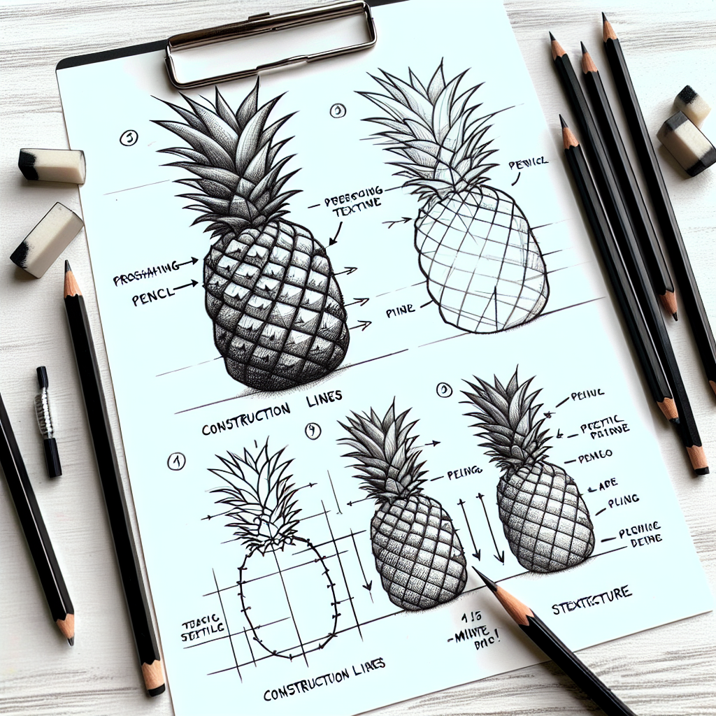
Texture is how graphite convinces the eye it's looking at fur, rust, glass, or worn wood. The secret is matching your mark-making to the surface, one object and one surface at a time.
Let the mark imitate the material
Different surfaces call for different marks: short flicked strokes for fur, tight stippling for grainy stone, long smooth gradients for polished metal. Choose the mark that behaves like the material before you start filling anything in. Rendering fur with the same even shading you'd use on a plain egg is exactly why so many texture attempts read as generic.
Texture is really about value contrast
What sells shininess versus softness is the value pattern, not the fussy detail. Glass and metal leap between bright highlights and near-black reflections with hard edges. Cloth and skin move gently through the mid-tones. Nail the contrast pattern of a surface and you can suggest the whole material with surprisingly few marks.
Suggest more than you draw
You rarely need to render every hair, brick, or thread. Detail one small area fully, imply the rest with looser marks, and let the viewer's eye fill the gap. Concentrating texture where it counts, at an edge or a highlight or a turning plane, keeps a study from collapsing into exhausting, flat busywork.